Wednesday 29 September 2010

Contextual and Theoretical Studies Level 5 Week 1:Week Task

We were assigned to write a brief intro to ourselves :

I am interested in becoming a games designer more specifically the concepts of both characters and environments but as i learn more throughout this course t broadens my eyes to more options but mainly towards games and i feel that this course has helped me in furthering my development into the games industry as well as the addition of having a person who has spent time in the games industry, in Mark Griffiths i can learn alot from.

I haven't really looked at much theory work and haven't really focused on it much but any theory involving the games, cartoons, comics, superhero and just any form of imaginary theory i could be opened to learning about. The book i had chosen for my brief was Darren Shahn's Lord Loss a book in which i had been recommended to and the last book i have read in a while so my choices weren't that big but i feel i made the right choice as i had a rough idea of doing a chess board movement type title sequence.

I'm not really sure what i would want from this module other than interesting theories behind what i would like to do or even something interesting like the back story of font had been interesting as we don't really focus on the origins of font and the many that are at our disposal.

Contextual and Theoretical Studies Level 5 Week 1:History of Type


Advanced version of the wooden letter block

Today's session was teaching the class of the history of type and where certain types of font had originated and evolved from and this was done in great timing of our project that is coinciding with the contextual studies on making a title sequence. The history of font can be traced to the days when Johannes Guthenberg introduced the wooden block to allow printing for the bible through ink being spread on the wooden block which had a specific letter carved into it and then written onto paper. Due to this procedure being expensive and a long procedure to accomplish the bible that were completed had to be attached to a steel chain as there were such a few of bible created that they were seen as priceless objects to have that people were trying to steal them.
Old English text was one specific type of font that i saw as a improvement of a basic design as it has this level of class from the font being more of a timing font style to create by adding more to the font you get that this font is to create a sense of high level rather than a running ink piece of font.


Tuesday 28 September 2010

Digital Film Production and VFX Week 1:My Idea and Storyboard

Storyboard
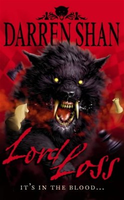
My idea is to involve the chess players scenario from the book, in a way in which the title sequence will have a chess board and chess peices that will move as a traditional chess game would be played out but my idea with the chess game being played is to embed the texts into chess pieces, have the texts being shown behind the pieces after they've moved, underneath the peices, on the chess board and more.

I will be doing 5 shots that will last 6 seconds each, 3 seconds for movement and 3 seconds for the title and the final shot are a compilation of extras that i will be able to use if i have time available. The Title sequence will begin with the movement of a chess piece to reveal the chess board and pieces and will have the camera move around the chess board to reveal titles and eventually finish with a check mate move to which the fallen piece rolls towards the screen.

I will be creating the chess pieces within Maya and animating them using the same software, the reason i have chosen to do so is because i had the option to use a local life size chess board but that would require filming and i believe that filming isn't my strong point however 3D modelling had stood out to me and i wanted to go back and try to model the objects for my title rather than plan to film my title sequence.


Each scene will consist of 6 seconds, 3 seconds of movement and 3 seconds of camera movement

Shot 1-The scene will begin with a black view as a low shot looking up, the scene will begin from there to the first piece moving to unveiling the chess game which will be half way through. The camera will stay in the same position whilst the piece moves and the first text is shown embedded within the piece.
Shot 2-This scene will begin with the camera movement switching or moving to mid shot as it turns right towards the next piece to show text down the side of the piece.
Shot 3-After the previous scene is finished the camera will again move from mid shot to low shot as it moves left towards one of the chess board squares, which will then have camera tilt down to a top view shot making another piece of text visible.
Shot 4-From the previous shot the camera will come back to on the chess board and then move or rotate the camera to the right. With the camera in place as a low shot focusing on the chess piece in front the viewers will see half of the text which will connect to the other piece coming across from the right side.
Shot 5-This shot will start off with the camera rotating to the left and move towards the final chess move, check mate, which will the horse cornoring the king and not allowing it to move anywhere thus making the king lose and bein knocked down and rolling towards the screen and causing it to fade out to black, through out this scene the shot will be a mid shot with the view of the horse visible.
 Extras-As you can guess are the extra ideas of shots that i am willing to involve with any time available, there are shots such as a mid side shot which would have each lettering of the text on the individual pieces, another is a top view looking down on the board and seeing the piece make its move and unveiling a text, one that is again a top view which shows the text on the rook piece along top of the piece and finally the far out shot looking over one side of the pieces to across the board which will have large lettering or text to make up a wordalong the front of the pieces.

Digital Film Production and VFX Week 1:Title Sequence Research

Before i had started to get my initial idea fully figured out, i had started to look at title sequences that stood out to me and i had found the following title sequences that had stood out because of their basic effects...

This title sequence was a good choice of mine because it shows the images of the story that and a glass shattering affect, which goes really well with the text as it doesn't allow the image to take up more of screen.

This affect allows the images to have the glass shatter effect on them but isn't used upon the text to allow it to stand in front and be focus point along with the image.


The next title sequence is another one that stood out because its not a sequence that focuses alot on one point but combines both and in this sequence it is used alot more although you would have to look more at the text to uncover what it says.

The usage of the text on signs gives it that realism. The combination of the two allows it to be apart of the backdrop which gives another understanding of what the movie is about.
Another great combination title sequence is the Napoleon Dynamite title sequence which i found had worked really well was because the film is about a high school male and his time through high school and because its his life the title sequence is just a sequence of his everyday life which with each sequence gives another piece of text and although it combines the two it works because it shows the brakfast scene with sauces used as the ink for their text.
This was only seen by me when it was used as an example of a title sequence but i had seen it and the simplistic sequence stands out because the text is used along with the view of the buildings. Showing the text next to the buildings works as it shows that the film is set with i New ork  from the many buildings and from the final image of a park which could be Central Park.
I have chosen another superhero title sequence because this one has the the whole scientific research and experiments going on in the title sequence whilst text appears around the images. This goes well in my view because you can see how the text is joint with the images and makes it more of an image.

The colour used for the text makes it stand out from the image because of the contrast of the bright green compared to the darker lab room and it has the effect of liquid that is used as part of an experiment.
X Men Origins:Wolverine the trialer is another that stood out but not the title sequence but an affect used for the Marvel and 20th Century Fox Logo where the story of the film comes across as you see the logos as a glass container that begins to fill up of adamantium, which is the storyline metal that is used as the material for Wolverines bones transplant. But what ha dstruck out to me from this affect is that it so simple but the affect is used as a indication of the turning point of the films storyline and the affect of the logo container slowly filling up with adamantium liquid  is a basic fade in affect as its see through logo which slowly fades in with the adamantium rising.

The Little Big Planet Intro is one that stands out the most from the various title sequences i have looked through but this was a user controlled title sequence as the player controls their sackboy going through various obstacles till you reach the end of the sequence but as you play along the background random objects appear or fall combined with the text of names of the creators and images of them aswell. But because this is an interactive title sequence that you wouldn't expect of a title sequence to be so interactive however because of this it makes the title sequence so unique and show the user what they can expect of the game as you play and the random objects catch the attention of the user, but because the game is about the creativity of gamers the sequence uses that creativity in the font style as each piece of text changes thus standing out with the random objects and imagery as you play along.


Digital Film Production and VFX Week 1:Choice of Books

Darren Shans Lord Loss
The book i have chosen is Darren Shan's Lord Loss of the Demonata Series, in which a teenage boy by the name of Grubitsch 'Grubbs' Grady and his family of chess players to which teh story begins with him comign home one night to find to find his family mutilated by demons, which gets him into a mental institute and gets taken away from there by his uncle who tells Grubbs more of his family background to which he then gets re-involved with Lord Loss who had mutilated his family.

I had chosen this book as it was part of the Demonata series to which i had been reading, that this first book in the series is mostly remembered to me and when remembering about the storyline i thought towards the chess playing family connection and thought that a chess scenario could be a good idea for my project and allow me to try my hand at Maya again as i have become accustomed to using it in the animation module.