Monday, 4 October 2010

Digital Film Production and VFX Week 2:Font Research Part1

I had been looking at some fonts that are used for films and title sequences that were similar to what type of style i will be going for. The type of style i was looking for was a horror, dark and eerie text that stood out as being a connection between the text and the dark mood of the book.

I had found this text which is the classic or basic point of horror text, as its just the text with a blood dripping effect. I believe that this is a good effect to get blood coming down and bleeding but because it had a basic text formatting the effext was less affective.


This text format makes the expectation of the game more clearer in the sense that its a horror based game in space, but for me it comes more across from the text also having a fading between the text and the background to give it more of a view that the text is part of the space but stands out because of the lighting effect around the lettering.
The text for this researched image wasn't the focus point of my attraction towards it but rather the background or colours used around the text. The colours used are red and black which are the main two components used to represent the horror image as it gives that sense of darkness and blood and the contrast between the two gives it a random effect which captures your eye.

This text represents the blodd dripping effect alot better than the first text researched as this uses the font style better, from what i can see it seems as though the text is metal based and has been used as a knife to puncture something. The blood appears over the letterin gto be dripped and the reason for this effect to be more advanced then the other is for the realistic colouring of the blood and lettering as this is more of a crimson dark red.
Effects used for horror come across as always being a dark shocking style and with this font the effect that is used is one which creates the feeling of the film being about the process of life or something that surrounds the graveyard mood.

The effect i am mentioning is the eroding text which could represent the whle decomposing of the flesh within a graveyard because of the dark blood colouring that is shown for the eroding text. Eroding text can also be seen as dirt being thrown across the text as a representation of the horror film being about someone being buried alive.
This text is  another example of a dark font used to show the horro genre from the basic flame manipulation used for the text and because flames are an unstable fear it shown a sense of fear of a dark, scary film. The font is simple but due to the font being engulfed in flames makes it stand out from the black background to give the viewer a much visible focal point. 
I had chosen this as a expectation of what i hope to achieve as the film as you can tell is about halloween but what caught my attention was the fact that the font isn't much of horror option but a basic bubbled, neon text and i found that because of the nature of the film the text represents it very well as the film is more about the halloween aspect and the text captures it throught the text being a bright orange colour of a pumpking and having the font style be so simplistic goes well with the image it is shown with.

Text of this simplicity is shown well with the image it is accompanying but by taking it away from the picture you will still get that eerie feel from it and i see that because of how the outline of the text is a dark orange in comparison to the pumpkin and which maybe the belief that the text could be a pumpkin and has been carved to show this text from the bright candle light that is shown within the text.

Digital Film Production and VFX Week 2:Mood Board

MoodBoard
On the right is my mood board which as you can see has a lot of dark images this is due to the book that i have chosen is a dark, an eerie, horror book.

Many of the images don't have too much of a difference in colour as many of the colour used are dark and blending with a a few bits of bright colours to have a significant area of the image stand out.

The images have similar styles such as the contrast of colours to have the image merged with its colour creates a more understanding of whats going on and what the image is trying to get across to the audience.

For my title sequence i had begun to see if there could be a connection between the colour and the title sequence and using the cover of the book i could use a dark backdrop which has a shade of red fading in and out on the dark backdrop, similar to the right side of the mood board which gives off the sense of anger, fear and bloodshed (a connection to the story of the book).

Wednesday, 29 September 2010

Contextual and Theoretical Studies Level 5 Week 1:Week Task

We were assigned to write a brief intro to ourselves :

I am interested in becoming a games designer more specifically the concepts of both characters and environments but as i learn more throughout this course t broadens my eyes to more options but mainly towards games and i feel that this course has helped me in furthering my development into the games industry as well as the addition of having a person who has spent time in the games industry, in Mark Griffiths i can learn alot from.

I haven't really looked at much theory work and haven't really focused on it much but any theory involving the games, cartoons, comics, superhero and just any form of imaginary theory i could be opened to learning about. The book i had chosen for my brief was Darren Shahn's Lord Loss a book in which i had been recommended to and the last book i have read in a while so my choices weren't that big but i feel i made the right choice as i had a rough idea of doing a chess board movement type title sequence.

I'm not really sure what i would want from this module other than interesting theories behind what i would like to do or even something interesting like the back story of font had been interesting as we don't really focus on the origins of font and the many that are at our disposal.

Contextual and Theoretical Studies Level 5 Week 1:History of Type


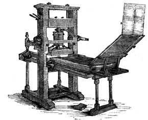
Advanced version of the wooden letter block

Today's session was teaching the class of the history of type and where certain types of font had originated and evolved from and this was done in great timing of our project that is coinciding with the contextual studies on making a title sequence. The history of font can be traced to the days when Johannes Guthenberg introduced the wooden block to allow printing for the bible through ink being spread on the wooden block which had a specific letter carved into it and then written onto paper. Due to this procedure being expensive and a long procedure to accomplish the bible that were completed had to be attached to a steel chain as there were such a few of bible created that they were seen as priceless objects to have that people were trying to steal them.
Old English text was one specific type of font that i saw as a improvement of a basic design as it has this level of class from the font being more of a timing font style to create by adding more to the font you get that this font is to create a sense of high level rather than a running ink piece of font.


Tuesday, 28 September 2010

Digital Film Production and VFX Week 1:My Idea and Storyboard

Storyboard
My idea is to involve the chess players scenario from the book, in a way in which the title sequence will have a chess board and chess peices that will move as a traditional chess game would be played out but my idea with the chess game being played is to embed the texts into chess pieces, have the texts being shown behind the pieces after they've moved, underneath the peices, on the chess board and more.

I will be doing 5 shots that will last 6 seconds each, 3 seconds for movement and 3 seconds for the title and the final shot are a compilation of extras that i will be able to use if i have time available. The Title sequence will begin with the movement of a chess piece to reveal the chess board and pieces and will have the camera move around the chess board to reveal titles and eventually finish with a check mate move to which the fallen piece rolls towards the screen.

I will be creating the chess pieces within Maya and animating them using the same software, the reason i have chosen to do so is because i had the option to use a local life size chess board but that would require filming and i believe that filming isn't my strong point however 3D modelling had stood out to me and i wanted to go back and try to model the objects for my title rather than plan to film my title sequence.


Each scene will consist of 6 seconds, 3 seconds of movement and 3 seconds of camera movement

Shot 1-The scene will begin with a black view as a low shot looking up, the scene will begin from there to the first piece moving to unveiling the chess game which will be half way through. The camera will stay in the same position whilst the piece moves and the first text is shown embedded within the piece.
Shot 2-This scene will begin with the camera movement switching or moving to mid shot as it turns right towards the next piece to show text down the side of the piece.
Shot 3-After the previous scene is finished the camera will again move from mid shot to low shot as it moves left towards one of the chess board squares, which will then have camera tilt down to a top view shot making another piece of text visible.
Shot 4-From the previous shot the camera will come back to on the chess board and then move or rotate the camera to the right. With the camera in place as a low shot focusing on the chess piece in front the viewers will see half of the text which will connect to the other piece coming across from the right side.
Shot 5-This shot will start off with the camera rotating to the left and move towards the final chess move, check mate, which will the horse cornoring the king and not allowing it to move anywhere thus making the king lose and bein knocked down and rolling towards the screen and causing it to fade out to black, through out this scene the shot will be a mid shot with the view of the horse visible.
 Extras-As you can guess are the extra ideas of shots that i am willing to involve with any time available, there are shots such as a mid side shot which would have each lettering of the text on the individual pieces, another is a top view looking down on the board and seeing the piece make its move and unveiling a text, one that is again a top view which shows the text on the rook piece along top of the piece and finally the far out shot looking over one side of the pieces to across the board which will have large lettering or text to make up a wordalong the front of the pieces.

Digital Film Production and VFX Week 1:Title Sequence Research

Before i had started to get my initial idea fully figured out, i had started to look at title sequences that stood out to me and i had found the following title sequences that had stood out because of their basic effects...

This title sequence was a good choice of mine because it shows the images of the story that and a glass shattering affect, which goes really well with the text as it doesn't allow the image to take up more of screen.

This affect allows the images to have the glass shatter effect on them but isn't used upon the text to allow it to stand in front and be focus point along with the image.


The next title sequence is another one that stood out because its not a sequence that focuses alot on one point but combines both and in this sequence it is used alot more although you would have to look more at the text to uncover what it says.

The usage of the text on signs gives it that realism. The combination of the two allows it to be apart of the backdrop which gives another understanding of what the movie is about.
Another great combination title sequence is the Napoleon Dynamite title sequence which i found had worked really well was because the film is about a high school male and his time through high school and because its his life the title sequence is just a sequence of his everyday life which with each sequence gives another piece of text and although it combines the two it works because it shows the brakfast scene with sauces used as the ink for their text.
This was only seen by me when it was used as an example of a title sequence but i had seen it and the simplistic sequence stands out because the text is used along with the view of the buildings. Showing the text next to the buildings works as it shows that the film is set with i New ork  from the many buildings and from the final image of a park which could be Central Park.
I have chosen another superhero title sequence because this one has the the whole scientific research and experiments going on in the title sequence whilst text appears around the images. This goes well in my view because you can see how the text is joint with the images and makes it more of an image.

The colour used for the text makes it stand out from the image because of the contrast of the bright green compared to the darker lab room and it has the effect of liquid that is used as part of an experiment.
X Men Origins:Wolverine the trialer is another that stood out but not the title sequence but an affect used for the Marvel and 20th Century Fox Logo where the story of the film comes across as you see the logos as a glass container that begins to fill up of adamantium, which is the storyline metal that is used as the material for Wolverines bones transplant. But what ha dstruck out to me from this affect is that it so simple but the affect is used as a indication of the turning point of the films storyline and the affect of the logo container slowly filling up with adamantium liquid  is a basic fade in affect as its see through logo which slowly fades in with the adamantium rising.

The Little Big Planet Intro is one that stands out the most from the various title sequences i have looked through but this was a user controlled title sequence as the player controls their sackboy going through various obstacles till you reach the end of the sequence but as you play along the background random objects appear or fall combined with the text of names of the creators and images of them aswell. But because this is an interactive title sequence that you wouldn't expect of a title sequence to be so interactive however because of this it makes the title sequence so unique and show the user what they can expect of the game as you play and the random objects catch the attention of the user, but because the game is about the creativity of gamers the sequence uses that creativity in the font style as each piece of text changes thus standing out with the random objects and imagery as you play along.


Digital Film Production and VFX Week 1:Choice of Books

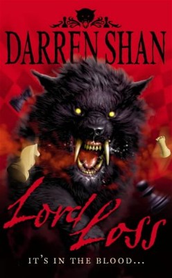
Darren Shans Lord Loss
The book i have chosen is Darren Shan's Lord Loss of the Demonata Series, in which a teenage boy by the name of Grubitsch 'Grubbs' Grady and his family of chess players to which teh story begins with him comign home one night to find to find his family mutilated by demons, which gets him into a mental institute and gets taken away from there by his uncle who tells Grubbs more of his family background to which he then gets re-involved with Lord Loss who had mutilated his family.

I had chosen this book as it was part of the Demonata series to which i had been reading, that this first book in the series is mostly remembered to me and when remembering about the storyline i thought towards the chess playing family connection and thought that a chess scenario could be a good idea for my project and allow me to try my hand at Maya again as i have become accustomed to using it in the animation module.

Wednesday, 9 June 2010

Mortal Kombat

Here is a Mortal Kombat video which is said to be a promo for a possible rebirth of the film series, although it isn't certain if there will be another Mortal Kombat film rebirth this video has become already a success:

Tuesday, 8 June 2010

Digital Films Week11:Evaluation of 1 Minute Film

My initial idea from the storyboard was kept as a guide throughout the final film however having 1 minute time scale i had to cut off certain bits of clips as well as cutting the animation down because the animation was taking a lot of time to do.

Using certain software again like Pencil, Photoshop and Maya was good as i was able to realize how they can be of benefit to me whilst doing other projects and Maya specifically had a big help because i was able to create a 3D archway to use as a model, which i could view in different places i wanted. Pencil was good as it allowed me to do frame by frame and view what i have done so far and Photoshop helped with the creation of the door and the mountains.

Overall the project had finished with a good outcome which is good in my view but could improve a lot with the shots, footage used and amount of animation as i believe with more animation it could have been a better film. However putting the quality of the film aside and focusing on the positives i was able to learn more on film making and learning new softwares as well as carrying on with programs not used as much.

Saturday, 5 June 2010

Inception Trailer

Here is a trailer of what seems like a film which will stand out in the minds of all because it adds that out of the ordinary look, from it's trailer is definately one to watch, July 13th:

Tuesday, 1 June 2010

Digital Films Week10:Helping Out

During waiting for me to start filming i was able to help out with other projects,

Such as Mark Griffiths filming on the left is an image, where at the back n the right i am holding the green screen, as well as helping with movement of equipment.


Another of my help to other films was to Chris Rhodes by doing a voice-over for his pizza ad,

And finally helping with John Fee's Robot film where i had help with setup as well as helping put costume on.


Digital Films Week10:Problems with timing

Once i started to get nearer to finishing the editing i had come across a few flaws in which i had a couple of seconds added to the 1 minute needed and so had to cut most of the shots as well as the length of shots.


I had added a text title to look like handwriting because i didn't want it to be better visually than the actual film and just for it to look basic.

Tuesday, 25 May 2010

Digital Films Week9:Green Screen

Here are a couple of images of Mark within the green screen setup to which was then taken into After Affects to be removed and use the live action from the footage to be used with my sketched background.


Using after affects was great to get rid of the green screen and manipulate the final footage within the artwork and at the start of using the After Affects software was a bit challenging however because i had many green screen footage's to edit i was able to become accustomed to how it works.

Digital Films Week9:Creature Interaction

Carrying on with the extra time available from not filming this week i was able to get a design done for my creature and was able to do a couple seconds of movement which will be considered as interaction once i put the animation with the footage.

Again i had chosen to do a basic creature because i didn't want to have to waste alot of time having to do frame by frame of detail and with that in mind i went for a fairly smooth shape for the body with limbs like Rayman.


The reason why i chose the rayman style body is because again a simplistic creature would save time in devvelopment and i always liked the basic view of Rayman and how his limbs look separate but move with the body.

However i didn't know whether i wante dto do the body moves, limbs move like Rayman so instead i went for limbs can move with the body as it's walking but if the whole of the body is moving up and down slightly, then the limbs won't be moving as the body does.

After having my creature set to animate i started with the basic movement of hands towards my live action clip and this is just the part of the creature as it would look interacting with the live action clip and so i have created around about 2 seconds of one sene where the creature is breathing and the next couple of seconds where the creature is interacting aka moving its hand towards, what will be the live action clip of Mark:

Digital Films Week9:Flying Creature

Myself, Mark, Chris and John planned to use the theatre hall to do our filming and Mark had been able to book the studio theatre but was only available to book it for 6:30pm-9:00pm and that wouldn't have given us enough time to do our filming as well as having no equipment available to be used, Mark had tried to book all of these a week in advance but the equipment had already been taken out.

So this week Mark and myself had been able to book the studio theatre and equipment out for next week to film in a full day which would allows us two weeks for editting and so with this week being available i continued with my development of sketches and animations. I was able to create my flying creature which will catch teh attention of my actor to make him turn to see a doorway.
After completing my flying creature design, i had chosento do a basic design allowing me to save time on doing detail after detail within each frame and so what i have created is basically a 24 frames per second of my flying creature flapping its wings for 1 second and using that 1 second of film i will duplicate it to make a continous film of a flying creature. Here is my 1 second flying creature:

Tuesday, 18 May 2010

Digital Films Week8:Archway Scene

I had started to sketch my archway hands on using photoshop when i looked at what i had done so far and noticed that i had different view points and the sketches didn't match up and so i was advised to try creating a 3D model of an archway to which i could use as a rough point for sketching.


After successfll creating a 3D moel of an archway i took a scrrenshot of the view i wouldn't to start from and transferred the image into photoshop to start my archway and I was able to see a vast improvement on the perspective and see how much tidier the sketch looks.


Using the mountains image i had previously created used it as a background image behing the archways.


As you can see on the left i went bck into maya and took another screenshot from my 3D model but at a different angle.


From that base i was able to add my sketch of the archway and the mountains.

Digital Films Week8:Background Mountains Sketches

Below are just two of the mountain background, which will be used in my film and from these two images i have tried to create different variations of the mountains combining parts of both of the sketches.


And below are the variation of background images that i will be using throughout the film:


Digital Films Week8:Visuals

I came up with having a basic background for my scenery as i started to look at different types of mountains because i wanted a mountain background to show a wasteland of hills and which wouldn't have any inhabitants.


Another image i want to use as a piece ofmy background as it shows the basic formation of earth and shows no sign of any life.


Then i started to look at the different ways of showing my archway and the different formations of the arches and found this visully stunning view from Assasins Creed II concept art and found having archways in the dark could hide any fine details.


Looking through fantasyartdesign.com i found this image which is similar to one of my scenes and shows a perspective of my walkthrough archway could be percieved.


Another archway which i saw as a stand out image is this one which is from the same site as mentioned and with this image, it wasn't the perspective but the arches that stood out because they have fine detail and how they are all linked, which shows a different view of archways.


Here is a image of a small pillar which i saw that stood out with it's pattern and how the figures and intwined with one another.